# Define parameters
alpha <- 0.025
power <- 0.80
target_effect_size <- 10
sd <- 50 # Standard deviation of the outcome.Maybe you have heard about the “Minimum Detectable Difference” (MDD) and the “Target Effect Size” in the context of clinical trials. These two concepts are crucial for the design of a study - not just in clinical trials, where we will describe the example below, but for experimental designs in general.
But what do they mean? And why are they different from each other? Let’s dive into this important design topic and clarify the differences between MDD and target effect size.
Minimum Detectable Difference (MDD)
The MDD is the smallest observed effect estimate at which the study will have a statistically significant result.
- If the observed effect estimate is equal to the MDD, then the p-value will be exactly equal to the pre-defined threshold \(\alpha\).
- If the observed effect estimate is smaller than the MDD, then the p-value will be larger than the pre-defined threshold \(\alpha\) and therefore the study will not be statistically significant any longer.
- On the other hand, if the observed effect estimate is larger than the MDD, then the p-value will be even smaller than the pre-defined threshold \(\alpha\).
The MDD should be chosen equal to the smallest effect size that is of clinical importance, and so is considered to lead to regulatory approval and commercial viability of the product.
Target Effect Size
The power of a study is the probability that the study will have a statistically significant result, given that the true effect size is equal to the value for which the study is powered for. This “powered value” is sometimes also called the “target effect size”.
The target effect size should be chosen to match the “target TPP” (Target Product Profile), which defines (among other things) the effect which the product should optimally achieve.
The target effect size will always be larger than the MDD, because the study should have a high probability of being statistically significant if the true effect size is equal to the target effect size. This also matches the definition of the product profile: The target TPP effect size will always be larger than the minimum TPP effect size.
It can be shown that for given significance level \(\alpha\) and type II error (1 minus power) \(\beta\) the ratio is
\[ \frac{z_{\alpha}}{z_{\alpha} + z_{\beta}} = (1 + z_{\beta} / z_{\alpha})^{-1} \]
irrespective of the underlying target effect size. Here \(z_{\alpha}\) and \(z_{\beta}\) are the z-values corresponding to the significance level \(\alpha\) and the type II error \(\beta\), respectively. For example, for \(\alpha = 0.025\) and \(\beta = 0.20\), i.e. 80% power, we have \(z_{\alpha} = -1.96\) and \(z_{\beta} = -0.84\), and the ratio is 0.7.
We will see this confirmed, together with other interesting relations between MDD and target effect size, below in the example.
Example
Let’s illustrate this with an example. Suppose we have a study with a continuous outcome, and we are interested in the effect of a new drug compared to placebo. We want to use a standard t-test to compare the two groups.
So here we set the one-sided significance level \(\alpha\) to 2.5%, the power to 80% for a target effect size of 10. The standard deviation of the outcome is assumed to be 50.
Now let’s calculate the sample size needed for the study, as well as the MDD, using rpact:
# Use rpact to calculate the sample size for the study.
library(rpact)
Installation qualification for rpact 4.2.1 has not yet been performed.Please run testPackage() before using the package in GxP relevant environments.design <- getSampleSizeMeans(
groups = 2,
normalApproximation = FALSE,
alpha = alpha,
beta = 1 - power,
alternative = target_effect_size,
sided = 1,
stDev = sd,
allocationRatioPlanned = 1
)
# Get sample size per group.
n <- ceiling(design$nFixed1)
n[1] 394# We also get the MDD.
mdd <- design$criticalValuesEffectScale[1]
mdd[1] 6.998138So we see that we need 394 patients per group to achieve a power of 80% for a target effect size of 10. The MDD is 7, which is around 70% of the target effect size, thus confirming the relation between MDD and target effect size explained above.
Now let’s make a graph where we can see the relationship between the effect size, the power, and the p-value.
For this we first need to define the power function and the p-value function, for an assumed target effect size (for the power) and observed effect size (for the p-value):
power_function <- function(effect_size) {
    design <- getDesignGroupSequential(kMax = 1, alpha = alpha, beta = 1 - power)
    result <- getPowerMeans(
        design = design,
        groups = 2,
        normalApproximation = FALSE,
        alternative = effect_size,
        stDev = sd,
        allocationRatioPlanned = 1,
        maxNumberOfSubjects = n * 2
    )
    result$overallReject
}
# Test it:
power_function(c(5, 7, target_effect_size, 15))
[1] 0.2883840 0.5010486 0.8005922 0.9876347p_value_function <- function(effect_size) {
t <- effect_size / (sd * sqrt(2) / sqrt(n))
# Use t-distribution for the p-value:
pt(t, df = 2 * n - 2, lower.tail = FALSE)
}
# Test it:
p_value_function(c(2, mdd, 7, target_effect_size))[1] 0.287333341 0.024913719 0.024883401 0.002561103We can see already here that:
- The power is increasing with larger assumed effect sizes. We fixed it to be 80% for the target effect size.
- The p-value is decreasing with larger observed effect sizes. The p-value is equal to the significance level \(\alpha\) at the MDD.
Now we can plot the graph:
# Generate data for plotting
effect_sizes <- seq(0, 15, length = 201)
powers <- power_function(effect_sizes)
p_values <- p_value_function(effect_sizes)

# Plot
design_10 <- data.frame(
    EffectSize = effect_sizes,
    Power = powers,
    PValue = p_values
)

library(ggplot2)
design_10 |>
    ggplot(aes(x = EffectSize)) +
    geom_line(aes(y = Power), color = "blue") +
    geom_line(aes(y = PValue), color = "red") +
    labs(
        y = expression(atop("Rejection Probability", "(Power)")),
        y.right = expression(atop("P-Value", "")),
        title = "Effect Size vs. Rejection Probability and P-Value",
        x = "Effect Size"
    ) +
    scale_y_continuous(
        name = "Rejection Probability (Power)",
        labels = scales::percent_format(accuracy = 1),
        breaks = seq(0, 1, by = 0.05),
        sec.axis = sec_axis(~ ., name = "P-Value", breaks = seq(0, 1, by = 0.05))
    ) +
    theme(
        axis.title.y = element_text(color = "blue"),
        axis.title.y.right = element_text(color = "red"),
        axis.text.y = element_text(color = "blue"),
        axis.text.y.right = element_text(color = "red")
    ) +
    geom_vline(xintercept = target_effect_size, linetype = "dashed") +
    geom_hline(yintercept = alpha, linetype = "dashed") +
    geom_hline(yintercept = power, linetype = "dashed") +
    geom_hline(yintercept = 0.5, linetype = "dashed") +
    geom_vline(xintercept = mdd, linetype = "dashed") +
    geom_point(aes(x, y), color = "blue", size = 3, data = data.frame(x = target_effect_size, y = power)) +
    geom_point(aes(x, y), color = "red", size = 3, data = data.frame(x = mdd, y = alpha)) +
    geom_point(aes(x, y), color = "blue", size = 3, data = data.frame(x = 0, y = alpha)) +
    geom_point(aes(x, y), color = "blue", size = 3, data = data.frame(x = mdd, y = 0.5))
Ignoring unknown labels:
• y.right : "expression(atop(\"P-Value\", \"\"))"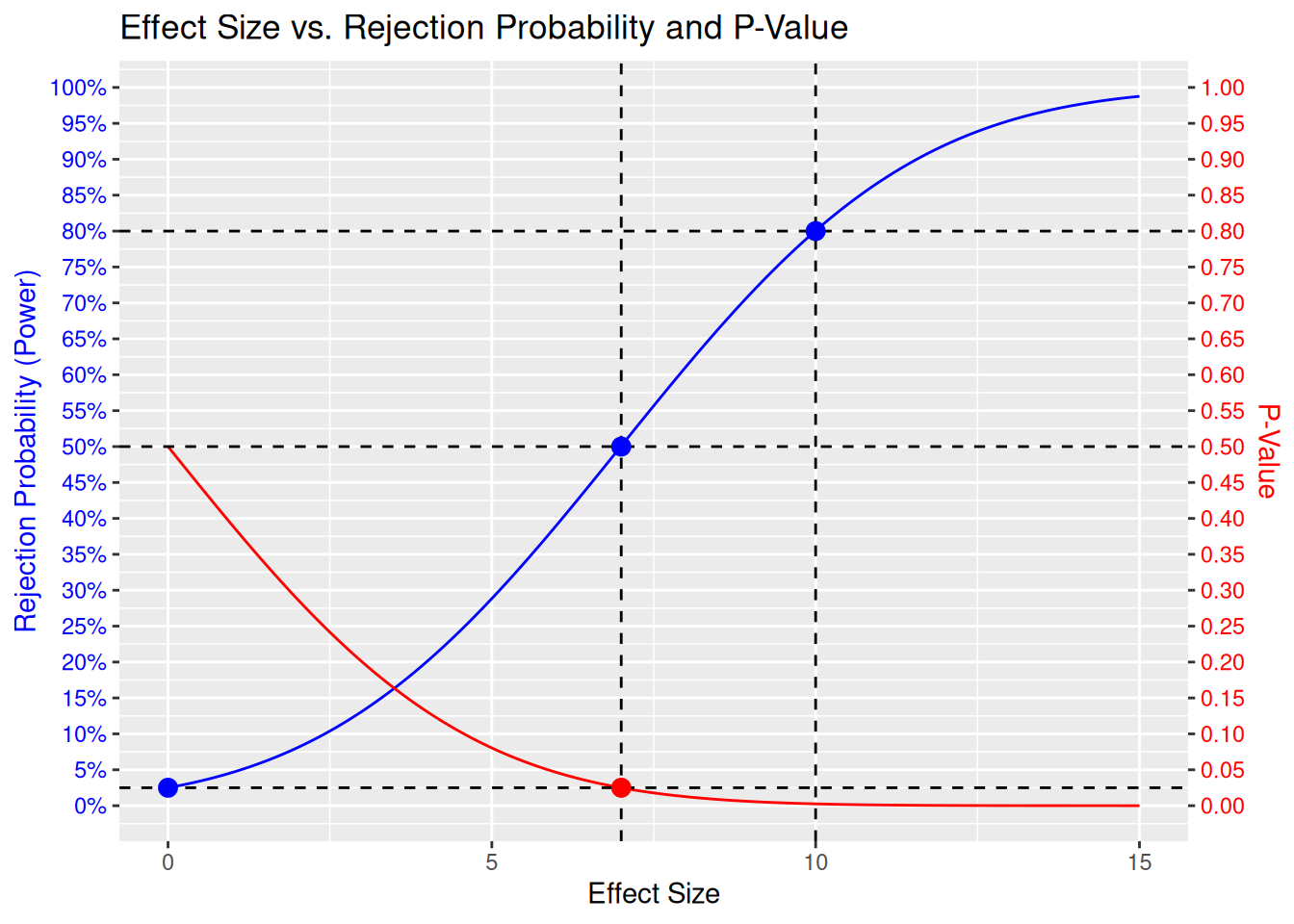
Here we can see the full picture. In addition to what was mentioned above, we also see:
- We fixed the power curve to be equal to the significance level \(\alpha\) for an effect size of 0: This is the null hypothesis, and we want to control the probability to falsely reject the null hypothesis to be small, i.e. below \(\alpha\).
- At the MDD we have exactly 50% power. That means, we are then flipping a coin to decide whether to reject the null hypothesis or not. Intuitively, this is because the observed effect size will randomly vary around the true effect size, which in this case would be exactly the MDD - so with 50% chance we will be above the MDD and with 50% chance below.
Comparison with Alternative Designs
Now we we want to add to the same plot two alternative designs, which have different power curves:
- target effect size 12 with 80% power (so same power but higher target)
- target effect size 10 with 90% power (so same target but higher power)
In order to do this, let’s generalize the power and p-value functions accordingly, such that they are parametrized by the power and the sample size per arm:
power_function2 <- function(effect_size, power, n_per_arm) {
    design <- getDesignGroupSequential(kMax = 1, alpha = alpha, beta = 1 - power)
    result <- getPowerMeans(
        design = design,
        groups = 2,
        normalApproximation = FALSE,
        alternative = effect_size,
        stDev = sd,
        allocationRatioPlanned = 1,
        maxNumberOfSubjects = n_per_arm * 2
    )
    result$overallReject
}

p_value_function2 <- function(effect_size, n_per_arm) {
    t <- effect_size / (sd * sqrt(2) / sqrt(n_per_arm))
    # Use t-distribution for the p-value:
    pt(t, df = 2 * n_per_arm - 2, lower.tail = FALSE)
}
And let’s have another function that gives us the sample size per arm:
get_sizes <- function(power, target_effect_size) {
    design <- getSampleSizeMeans(
        groups = 2,
        normalApproximation = FALSE,
        alpha = alpha,
        beta = 1 - power,
        alternative = target_effect_size,
        stDev = sd,
        allocationRatioPlanned = 1
    )
    list(
      n_per_arm = ceiling(design$nFixed1),
      mdd = design$criticalValuesEffectScale[1]
    )
}
Now we can calculate the sample sizes and corresponding power and p-value curves for the two alternative designs:
# Calculate sample sizes
sizes_12 <- get_sizes(0.80, 12)
n_per_arm_12 <- sizes_12$n_per_arm
mdd_12 <- sizes_12$mdd

sizes_10_90 <- get_sizes(0.90, 10)
n_per_arm_10_90 <- sizes_10_90$n_per_arm
mdd_10_90 <- sizes_10_90$mdd

# Calculate powers and p-values
design_12 <- data.frame(
    EffectSize = effect_sizes,
    Power = power_function2(effect_sizes, power = 0.80, n_per_arm = n_per_arm_12),
    PValue = p_value_function2(effect_sizes, n_per_arm = n_per_arm_12)
)

design_10_90 <- data.frame(
    EffectSize = effect_sizes,
    Power = power_function2(effect_sizes, power = 0.90, n_per_arm = n_per_arm_10_90),
    PValue = p_value_function2(effect_sizes, n_per_arm = n_per_arm_10_90)
)
And we can add the new power and p-value curves to the plot:
# Plot
design_10 |>
    ggplot(aes(x = EffectSize)) +
    geom_line(aes(y = Power), color = "blue") +
    geom_line(aes(y = PValue), color = "red") +
    geom_line(data = design_12, aes(y = Power), color = "blue", linetype = "dashed") +
    geom_line(data = design_12, aes(y = PValue), color = "red", linetype = "dashed") +
    geom_line(data = design_10_90, aes(y = Power), color = "blue", linetype = "dotted") +
    geom_line(data = design_10_90, aes(y = PValue), color = "red", linetype = "dotted") +
    labs(
        y = expression(atop("Rejection Probability", "(Power)")),
        y.right = expression(atop("P-Value", "")),
        title = "Effect Size vs. Rejection Probability and P-Value",
        x = "Effect Size"
    ) +
    scale_y_continuous(
        name = "Rejection Probability (Power)",
        labels = scales::percent_format(accuracy = 1),
        breaks = seq(0, 1, by = 0.05),
        sec.axis = sec_axis(~ ., name = "P-Value", breaks = seq(0, 1, by = 0.05))
    ) +
    theme(
        axis.title.y = element_text(color = "blue"),
        axis.title.y.right = element_text(color = "red"),
        axis.text.y = element_text(color = "blue"),
        axis.text.y.right = element_text(color = "red")
    ) +
    geom_hline(yintercept = alpha, linetype = "dashed") +
    geom_hline(yintercept = 0.5, linetype = "dashed") +
    geom_hline(yintercept = 0.8, linetype = "dashed") +
    geom_hline(yintercept = 0.9, linetype = "dashed") +
    geom_vline(xintercept = 10, linetype = "dashed") +
    geom_vline(xintercept = 12, linetype = "dashed") +

    geom_point(aes(x, y), color = "blue", size = 3, data = data.frame(x = 10, y = power)) +
    geom_point(aes(x, y), color = "red", size = 3, data = data.frame(x = mdd, y = alpha)) +
    geom_point(aes(x, y), color = "blue", size = 3, data = data.frame(x = 0, y = alpha)) +
    geom_point(aes(x, y), color = "blue", size = 3, data = data.frame(x = mdd, y = 0.5)) +

    geom_point(aes(x, y), color = "blue", size = 3, data = data.frame(x = 12, y = 0.8)) +
    geom_point(aes(x, y), color = "red", size = 3, data = data.frame(x = mdd_12, y = alpha)) +
    geom_point(aes(x, y), color = "blue", size = 3, data = data.frame(x = mdd_12, y = 0.5)) +

    geom_point(aes(x, y), color = "blue", size = 3, data = data.frame(x = 10, y = 0.9)) +
    geom_point(aes(x, y), color = "red", size = 3, data = data.frame(x = mdd_10_90, y = alpha)) +
    geom_point(aes(x, y), color = "blue", size = 3, data = data.frame(x = mdd_10_90, y = 0.5))
Ignoring unknown labels:
• y.right : "expression(atop(\"P-Value\", \"\"))"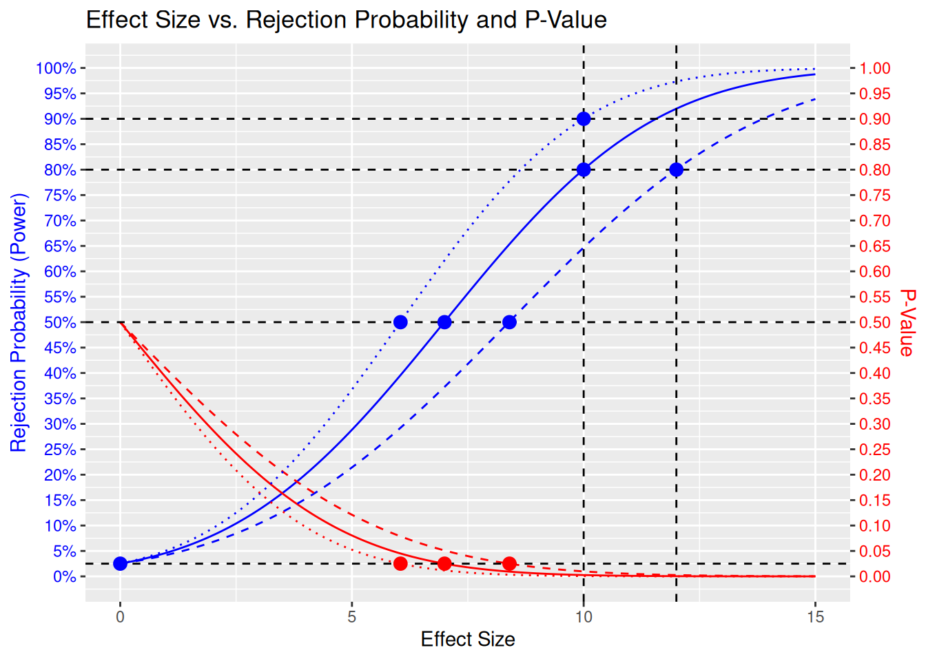
Here we see the following 3 designs:
- The original design with target effect size 10 and 80% power, with continuous lines. This needs 394 patients per arm, or 788 patients in total. The MDD is 7.
- The design with target effect size 12 and 80% power, with dashed lines. This needs 274 patients per arm, or 548 patients in total. The MDD is 8.4.
- The design with target effect size 10 and 90% power, with dotted lines. This needs 527 patients per arm, or 1054 patients in total. The MDD is 6.
Summary
I think it is easy to remember the following mental image of the power curve:
- On the left is the null hypothesis value, here the power curve is fixed at the significance level \(\alpha\), here chosen at one-sided 2.5%.
- On the right is the target effect size, here the power curve is fixed at the power level, typically 80% or 90%.
- In the middle is the minimal detectable difference (MDD), here the power curve is at 50%. In other words, the MDD is the “EC50” of the power curve!